With great thanks to Alan (aka PugetHouse), I have added a new weapon to Seattle Bubble's statistical war chest: price breakdowns.* It is fairly common knowledge that although it is the most convenient indicator to discuss, the median sales price does not give a very complete picture of the changing housing market. Price breakdowns, i.e. how many homes sold each month in a given price range, will hopefully give us some additional understanding about what is really going on with home prices.
All the numbers below refer to closed "residential" sales in King County only. As usual, all the data and charts found in this post have been added to the Seattle Bubble Spreadsheet for your number-crunching pleasure.
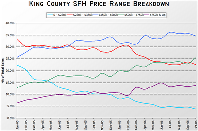
The NWMLS breaks the data down into 29 different price brackets, but for ease of viewing, I have lumped the figures into the following five price brackets: 0 - <$250k, $250k - <$350k, $350k - <$500k, $500k - <$750k, & $750k & Up. To start off, here's a chart showing the percentage of total monthly sales that each bracket accounted for from 2005 through last month.
A particular point of interest is March of this year, when the percentage of homes sold in the $250k - $350k range took a 3.5 point nose-dive (30.5% to 27.0%), while the $500k - $750k range jumped 2.4 points (19.6% to 22.0%) and the $750k & Up range jumped 3.4 points (9.5% to 12.9%).
The most dramatic change was in the up to $250k price range, which plummeted from 22.2% of sales in January 2005 (median: $330,000) to a mere 3.8% in October 2006 (median: $440,000). Also worth noting is the approximate doubling of both the $500k - $750k range (from 12.7% to 25.4%) and the $750k & Up range (from 6.3% to 13.8%).
Here is another way of looking at the data:
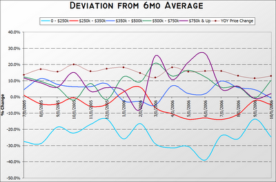
In this chart, I have plotted the percent change of each category's monthly share from its average share over the previous six months. For example, in the six months prior to January 2006, sales of homes in the 0 - $250k range made up 10.7% of all sales, while in January that range accounted for just 7.9% of sales, so the total share of sales for the 0 - $250k range was 25.8% lower in January 2006 than the previous six months. Since theoretically there should be little to no seasonal affects on the price breakdown percentages, I believe that a six-month average is a good way to look at the trend.
As you can see, the $250k - $350k and $350k - $500k price ranges tend to hold relatively steady, not deviating much more than +/- 10% most months. However, the low end (0 - $250k) has been consistently dropping, most months by over 20% of the previous six-month total. Also interesting is the surge in sales of $500k - $750k and $750k & Up during the spring and summer of this year, with the high end breaking the +20% barrier three times.
What does this all mean? Good question. Obviously if all homes were appreciating equally, we would expect to see the percentage of sales in the lower price ranges steadily decline, and the higher price ranges steadily increase. To some degree, that's what we are seeing here. On the other hand, the theory that an unusually large amount of high-end sales might be skewing the median upward certainly seems defensible, given the sustained spike in the upper two brackets since March.
I don't think this particular piece of the puzzle is enough data to draw any strong conclusions, but I definitely find it interesting.
* Although these statistics were gathered via searches of the NWMLS database, I should include the following disclaimer: Statistics not compiled or published by NWMLS.
