Demand Down, Supply Up, Prices Dip
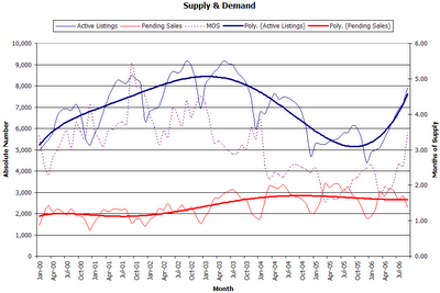
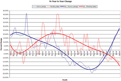
It's that time of the month again. Time for fun with numbers. September figures from the NWMLS have been posted. King County Residential inventory jumped even more than I was expecting, up 28.79% from last year. Sales tanked nearly 20% from August, and are down 20.59% from last year. Median sales price for single-family homes in King County actually decreased from August, down to $425,000 (up 11.48% from September 2005).
It is worth noting that the while inventory commonly increases from August to September, last month's 10% jump is the largest increase over that time period in at least the last seven years. Likewise, sales tend to decline in September, but last month's nearly 20% drop from August is the largest September drop since 2001. Furthermore, the last time that the median sales price from August to September dropped by more than last month's 2.30% was 1998.
Also interesting is the fact that the "months of supply" number (inventory / pending sales) shot up almost a full month—the largest jump since December 2000—from 2.54 to 3.49, a value not seen since Winter 03-04. If that rate of change stays steady (I doubt it will), we will reach six months of supply (generally seen as a "balanced market") before the new year.
As is traditional, I have uploaded an updated version of the Seattle Bubble spreadsheet for your number-crunching pleasure. Don't forget that you can always find the link to the spreadsheet on the sidebar.
Here are the supply & demand graphs.


8 comments:
Let's play "Predict the Spin"
I predict that the local papers will focus most of their articles on the fact that there is "still double-digit appreciation," and that they will claim that any signs of a slowdown are merely standard seasonal slowing.
I hope to be proven wrong.
I predict that the local papers will focus most of their articles on the fact that there is "still double-digit appreciation,"
I concur there Tim. You can spin stats any which way but loose, and the "still strong" housing market mantras followed up by "robust job-growth, blah, blah, blah" will be the stock quotes of the day. I'm sure we'll hear the typical "While the rest of the country..." and "we've managed to escape the worst of it..." nonesense. The thing is, I've noticed Seattle press is about 1/2 yr. to a full yr. behind the curve. We're currently hearing the "soft landing" arguement, something the national press has long since abandoned.
But again, if you look at numbers, you can get the YOY camel hump affect. YOY, while a decent timelime for real estate in long term doesn't capture mid-year surges. Prices can be crashing, but a YOY +% increase won't capture the plummeting affect. Who knows, prices may've been up 30% YOY just last month, but you wouldn't know it...
Wow, did not expect a price drop for months. It is the highest Sept inventory for King SFH since Sept 2003. The biggest indicator after the price is the pending sales drop YoY of -20.59%
Tim, Thanks for the actual pdf data and analysis.
Amit
this is it, Seattle is not different. it's doing what the rest of the US was doing in 05
I'm not suprised to see the inventory numbers. My anecdotal observations on the eastside have reflected this. On the way home from work yesterday I counted "for sale" signs for houses actually on the road I drive, not side streets. For the 3 mile residential route, the grand total was eight houses for sale, one with a "sold" placcard. That does not count the new subdivision being built apparently on spec near work, with room for probably 8-10 McMansions "from the $1M!".
I would love to see some sort of pricing graph superimposed over the supply/demand curve.
Alan, you are in luck. The spreadsheet contains just what you're looking for. It's the second graph (the percent change from year to year), with the percent change in the median plotted on a second y-axis on the right-side. The page in the spreadsheet is titled "S&D % w Median" and in fact it's the page the spreadsheet should open to by default. If for some reason you can't or don't want to use Excel, here's a snapshot.
flopfolder,
I agree. That's why I made sure to point out that these kinds of trends in September are not an uncommon occurrence. This drop is larger than most others have been, but I don't intend to make a big deal about price stagnation or drops until/unless it happens in the spring.
What's most interesting to me now is the surging inventory and plummeting sales.
Post a Comment